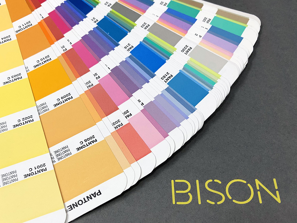
In anticipation of Pantone’s imminent unveiling of the Colour of the Year for 2019, the debate about the announcement is hotting up at BISON HQ.
Each December, the Pantone Colour Institute sets the trends for the branding, marketing and creative arenas by naming its colour of the year. The influential reach of the chosen colour is huge – touching fashion, marketing and even politics.
We’ve been speculating here at BISON over what will take over from 2018’s colour – ultra violet – and we’d would love to hear what you think over on social media.
To inspire you and get you thinking, the team have taken to their soapboxes and put forward the case for the colour they believe will win the coveted hotspot.
Not-so-mellow yellow
Mark and Claire are backing a bright, BISON, yellow all the way.
It’s no secret that Mark, BISON’s MD, has long been a fan of yellow, ‘I chose yellow for the BISON brand after a Christmas shopping trip to London’s West End, because Selfridge’s iconic yellow-and-black shopping bags stood out a mile in the crowds. Yellow is effervescent, dynamic and a little bit dazzling, just like BISON. And it’s the colour chosen by other great brands, too. Not many people know that Ferrari is actually a yellow company, it used red to commemorate soldiers and that became popular, but the badge has remained yellow. So we’re in good company.’
Mark believes that BISON’s decision to adopt yellow for the branding was ahead of the curve, and that we’ve not yet reached peak yellow.
Claire, BISON’s Customer Representative, is flying a yellow flag too.
She says, ‘It’s a cheery and fun colour and I think it’s just the shade we all need now. We enjoyed a fabulously hot summer and we don’t want the sunshine to fade just yet. I’ve bought myself a yellow handbag and snood, and I’ve got my eye on a yellow winter coat, too.’
Claire’s shopping reflects trends in retail where sales of all things yellow are really on the up. Meghan Markle inspired us with a bright-yellow shift dress this year, an outfit choice which saw John Lewis’s sales of dresses in that colour increase by a whopping 400% – and not all of that is down to Claire.
Fifty shades of …
Kai, BISON’s Large Format Specialist, wants to see an unsung shade receive some recognition this year, claiming that it’s time for the shades to step into the limelight.
Kai is supporting Cool Grey 11 C because he’s noticed that the multitude of popular vibrant colours tend to change from client to client and promotion to promotion, while the same shades remain constant.
He explains, ‘A large number of clients choose a shade like Cool Grey 11 C to support the hero colour. We find shades calming and complementary and they play an important role in colour management, which is often overlooked.’
Kai is bang on trend, with grey rising in popularity for interiors and Dulux paint hailing grey as the new magnolia.
He continues, ‘I bet that most people have a shade of grey on the walls in their homes, maybe not as dark as Cool Grey 11 C but a shade nonetheless. That is why I feel 2019 should be the year for shades.’
Orange 21
Chris, BISON’s Production Manager, puts forwards a simple argument for orange, ‘I like orange because it’s bright and vibrant.’
Chris’s choice is definitely in tune with the Spring/Summer 2019 Pantone Fashion Colour Trend report, which highlights our desire to face the future with empowering colours that provide confidence and spirit: ‘Colours that are uplifting, joyful hues that lend themselves to playful expressionism.’ Well, that’s definitely orange.
Back-to-nature green
Account Manager, Jenna, predicts a calming, earthy green, like Terrarium Moss (18) that reflects Scandinavian trends towards Hygge and simplicity in the home.
‘We’re all conscious of the environment at the moment, and I think there’s a desire to spurn fast-fashion and consumerism, go back to basics and connect with nature, and that’s why I’m backing green.’
True blue
BISON’s lead designer, Matt, forecasts a true-blue future for a colour that has a lot to say about itself.
‘Blue is a great choice for many brands because it conveys lots of positive values such as trust, friendliness and approachability. After analysis and research, I chose blue for the successful rebranding of Your Travel Group, which has proven to be a successful choice for them.’
It certainly works for IBM, American Express and Ford, but we’ll have to wait and see if Matt is right and Pantone will be encouraging us all to do some blue-sky thinking.
Don’t forget to check back in December; we’ll be one of the first to announce the official Pantone Colour of the Year for 2019.
If you would like to keep updated with all news and developments, please subscribe to our mailing list.