Before working with BISON, Moolands branding had barely changed since day one. The cow print on the vans made the business instantly recognisable, but beyond that there was little structure. From stationery to email signatures, nothing aligned. The brand no longer reflected the scale, ambition or professionalism the company had grown into.

Once meeting with BISON to understand the goal, the ambition became clear – to position Moolands as more corporate, more established and more cohesive, with every touchpoint working together under one considered identity.
BISON did a deep-dive on Moolands, speaking with staff and examining how the brand would function in real, everyday scenarios, making sure we fully understood where Moolands were currently positioned, and where they wanted to be at the end of the process. It was thorough and demanding, but ultimately transformative. The journey required commitment, yet it has become a genuine selling point for Moolands – proof of a business that takes itself seriously and invests in how it shows up. It was clear that Moolands was attached to their iconic cow print, and so this was taken into consideration during the create process, carrying through their legacy into a new modern vision.

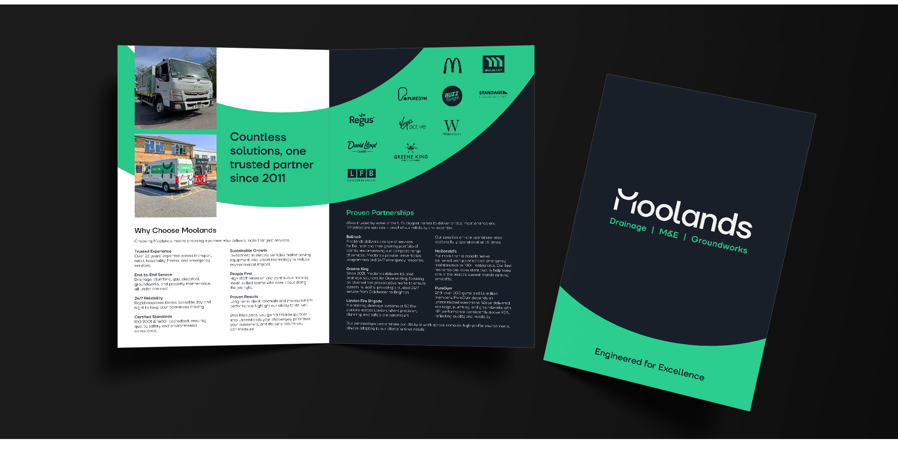
Following the approval of the new Moolands brand, BISON rolled out comprehensive fleet graphics, soft-touch laminate business cards, a custom pitch deck design, and bespoke stationery to bring their whole identity together. This rebrand process allowed Moolands to establish themselves in their industry as streamlined professionals with an eye for detail.
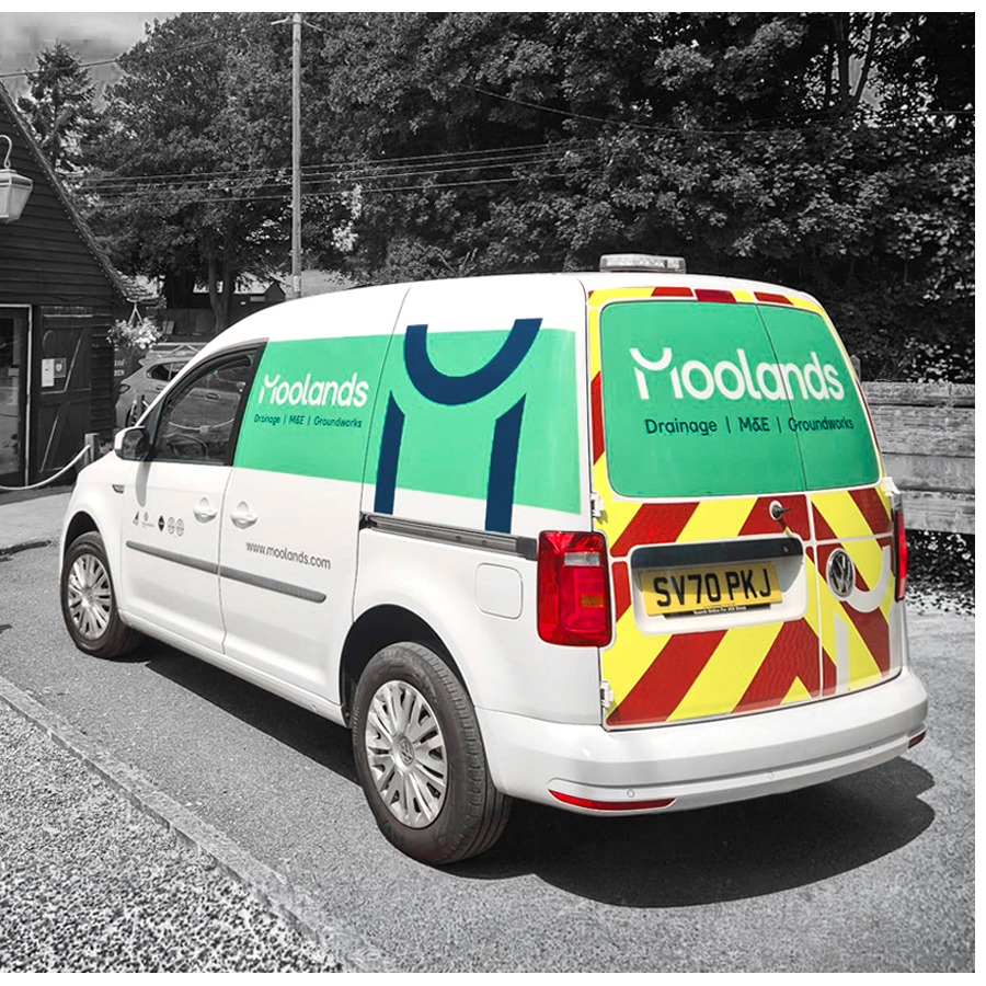
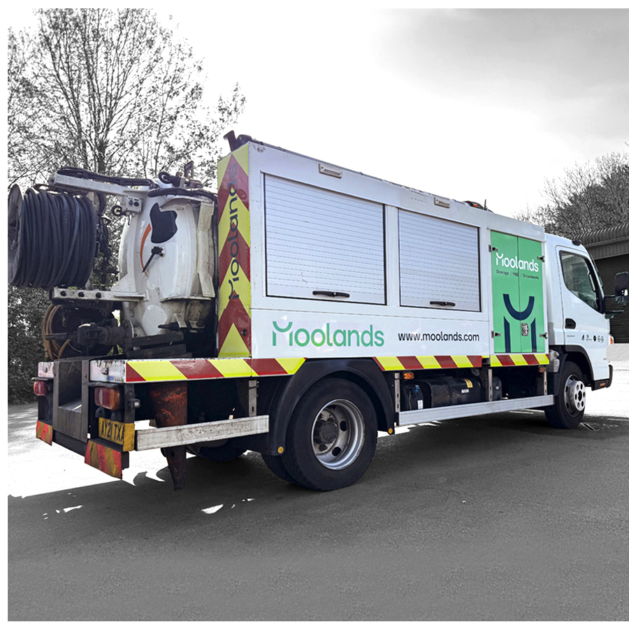
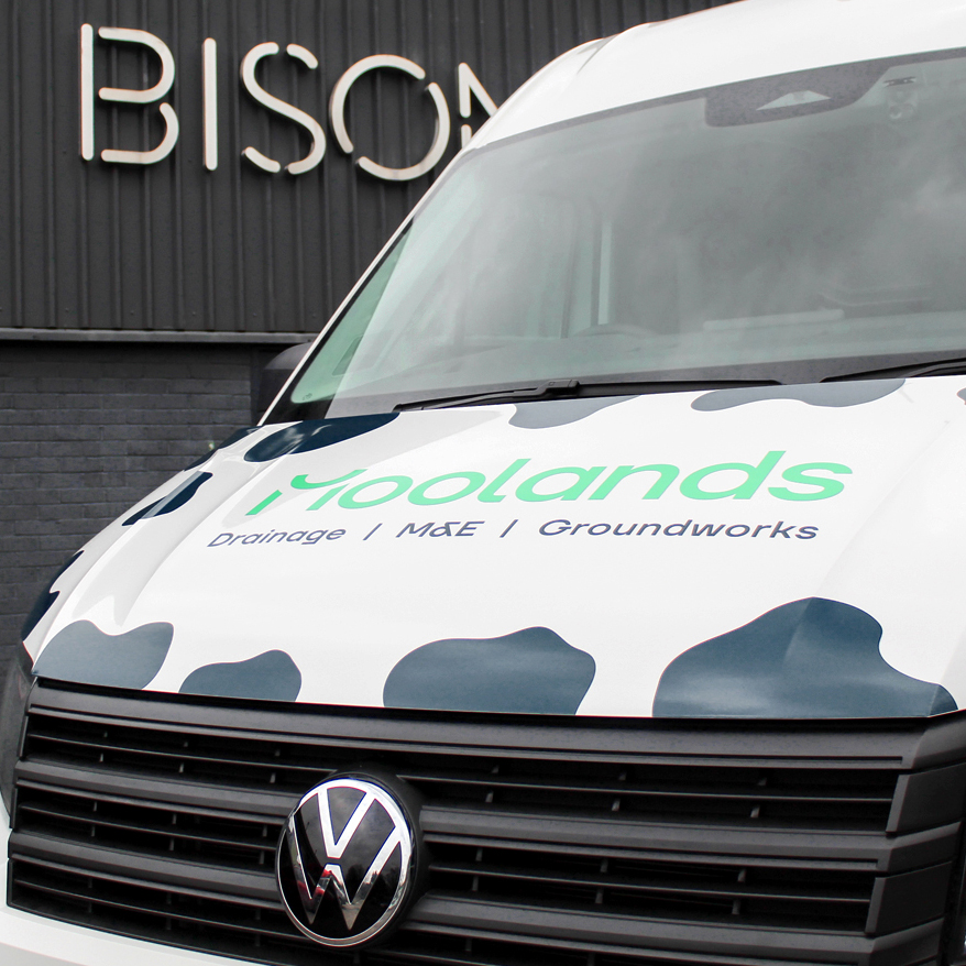
Tyrone, Director said, ‘The reaction has been brilliant. People constantly comment on the vans. I am particularly pleased we kept the cow print on the front, because it is the first thing people spot as the vehicles come towards them. Once they see the full design and the green, everything stands out in the best way. The stationery may not attract comments, but it does exactly what it should – it brings the whole identity together.’


Moolands has retained their recognisable cowprint brand element, and elevated their branding to strategically position themselves as professional, reliable and memorable. By recognising what makes them Moolands, they have built a strong association for their clients, who can point out their fleet of vans on the street, their signage in the community, and the quality of their service that defines them.
Before working with BISON, our branding had hardly changed since the day we started. We were known for the cow print on the vans, which made us recognisable, but beyond that there was no structure or consistency. Nothing matched across the business, from stationery to email signatures, and it no longer reflected the size or professionalism of the company we had become.
When I bought our first office and secured a new contract, it felt like the right moment to invest in a proper identity. I wanted us to look and feel more corporate, more established, and to have everything tied together under one clear brand.
What surprised me most about the process was the level of detail. BISON went deeper than I expected, speaking with staff and exploring every part of how the brand would live day to day. It was a lot of work, but it was worth every bit of it. I would not want to go through the whole journey again, but I am genuinely glad I did, because it has become a real selling point for the business.
The reaction has been brilliant. People constantly comment on the vans. I am particularly pleased we kept the cow print on the front, because it is the first thing people spot as the vehicles come towards them. Once they see the full design and the green, everything stands out in the best way. The stationery may not attract comments, but it does exactly what it should; it brings the whole identity together.
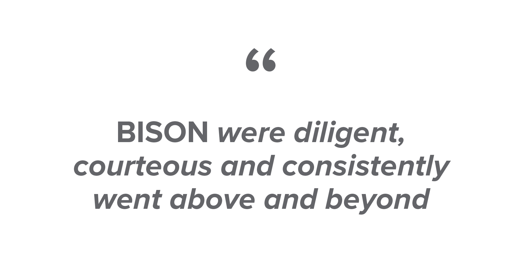
BISON were diligent, courteous and consistently went above and beyond. They listened to our ideas and were never afraid to suggest bold ones of their own. I have already recommended them several times, and I would not hesitate to do so again.