Milletts had come a long way since its early days as a one-man operation. With the business expanding to cover Electrical, Mechanical and Renewables, the team felt their original brand no longer represented who they had become.
That is when they came to BISON.

During our early conversations it became clear that, over time, the existing brand had started to drift. Slightly different shades of green had crept in, small logo variations appeared in different places, and without a formal identity system the brand had eroded. The name was staying, as were the proud green stripes, but the identity itself needed to evolve.
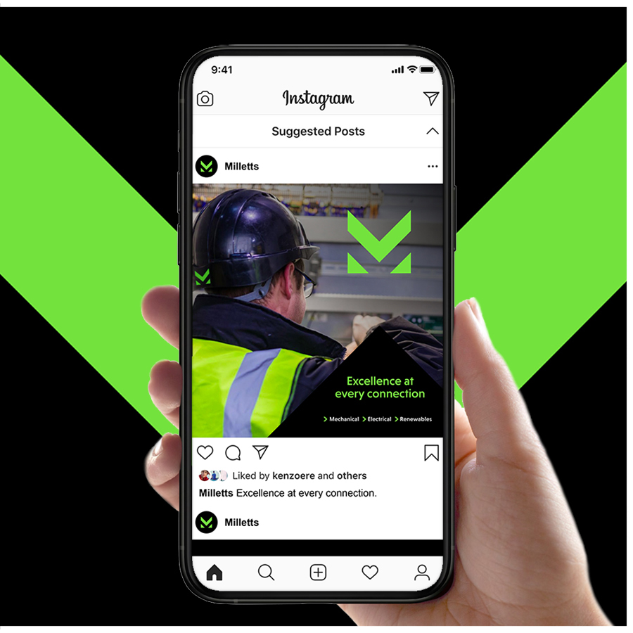
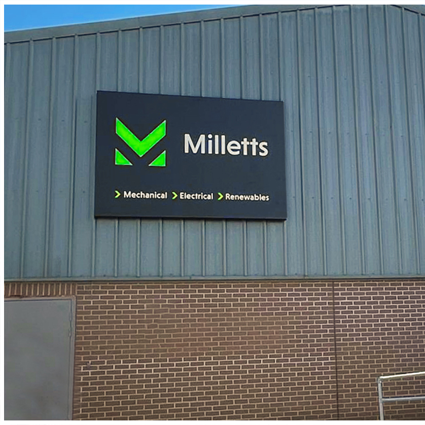
We explored a range of creative avenues, each designed to retain the essence of Milletts while elevating its clarity, impact and flexibility. The breakthrough came in reworking the familiar green chevrons into a bold, instantly recognisable M … a mark that was both rooted in their history and ready for what comes next.
Once the direction was chosen, we rolled the brand out across every key touchpoint, ensuring consistency and ease of use for the team moving forward.
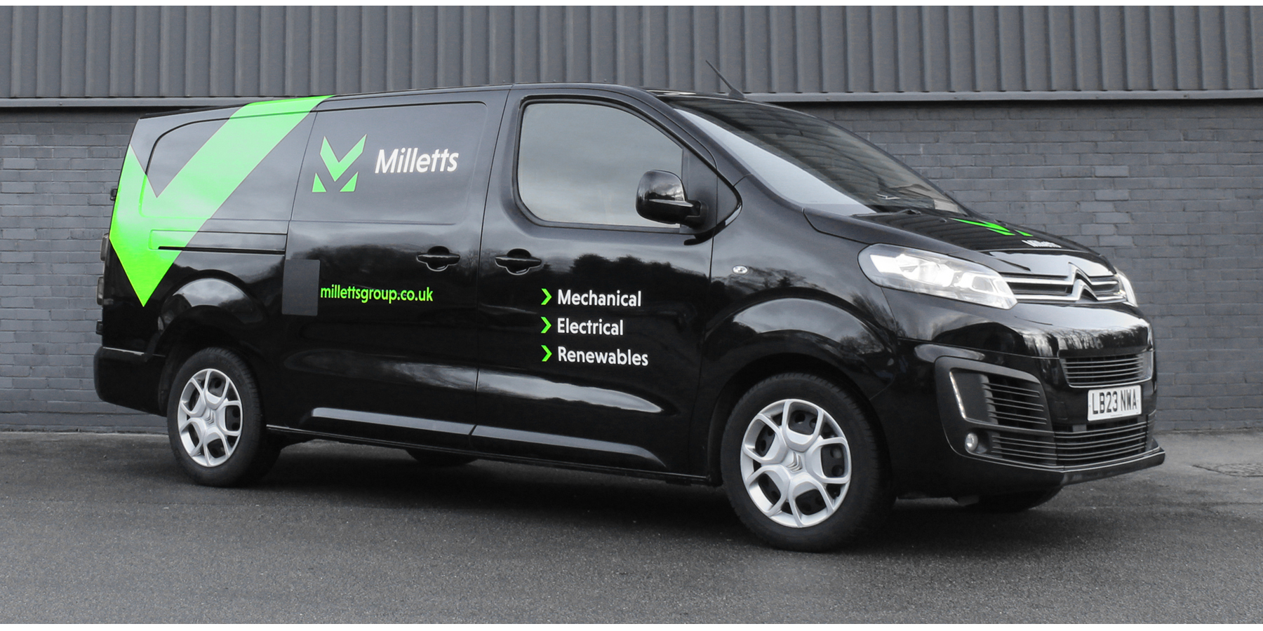
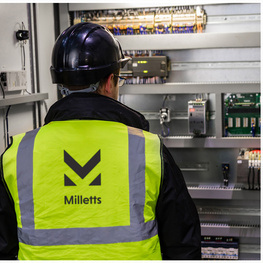
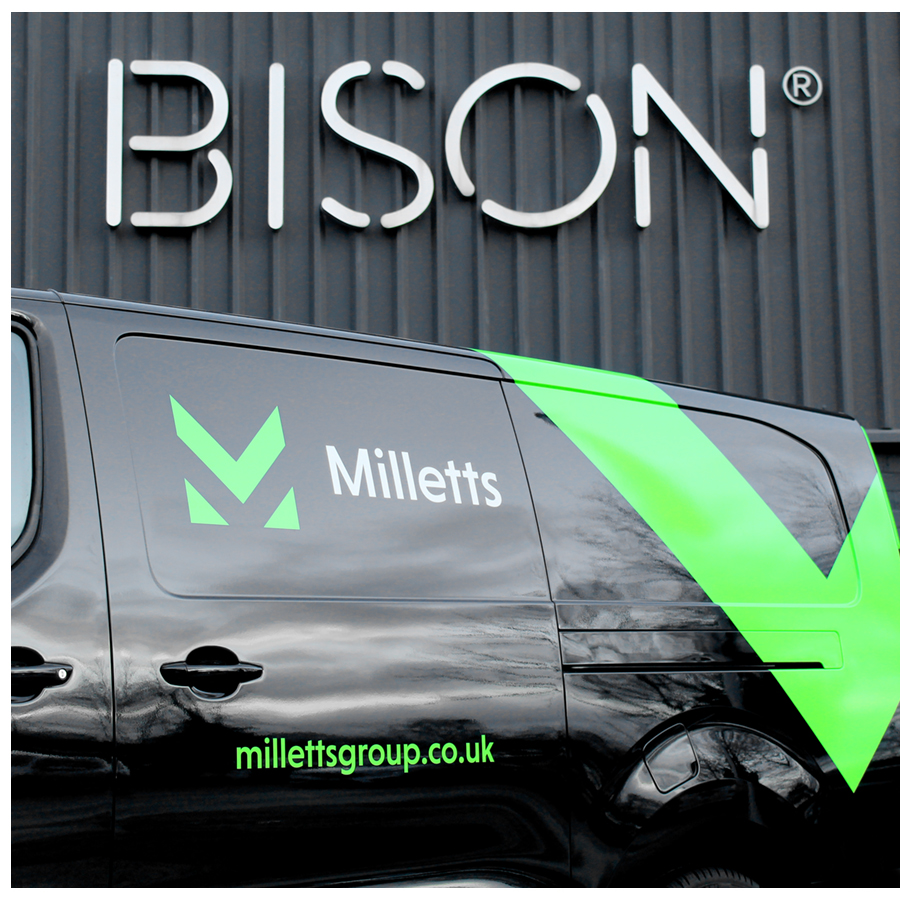
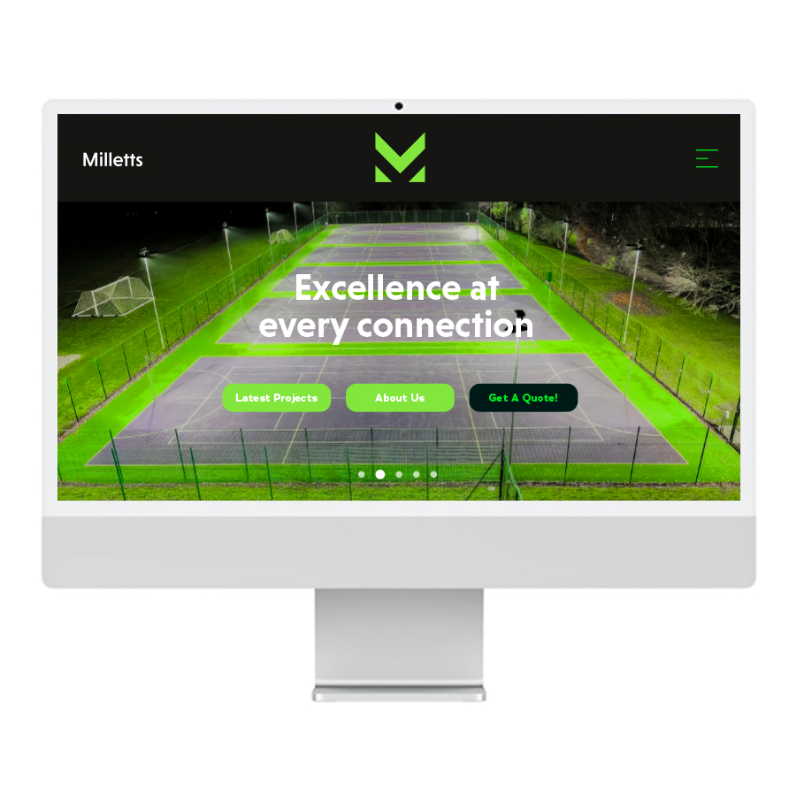
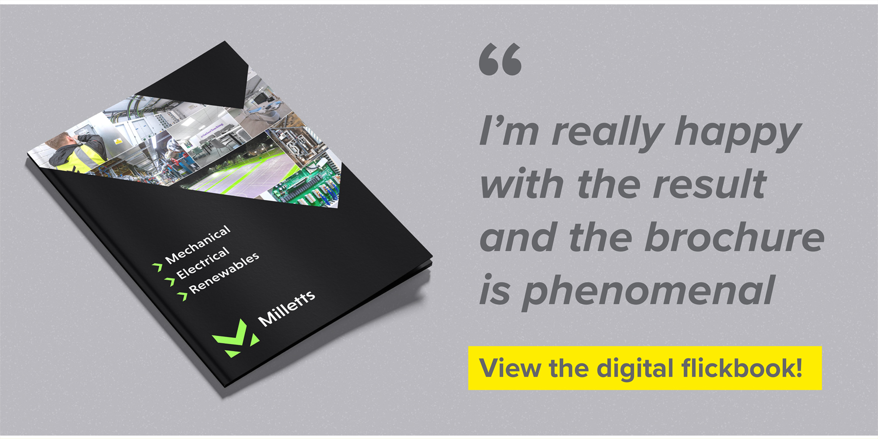
Since launch, the new brand has been met with unanimous positivity. It is stronger, more professional and far more cohesive, helping Milletts present themselves with confidence across all three service divisions. From building signage to fleet graphics to a standout brochure, the identity now works seamlessly wherever it appears.
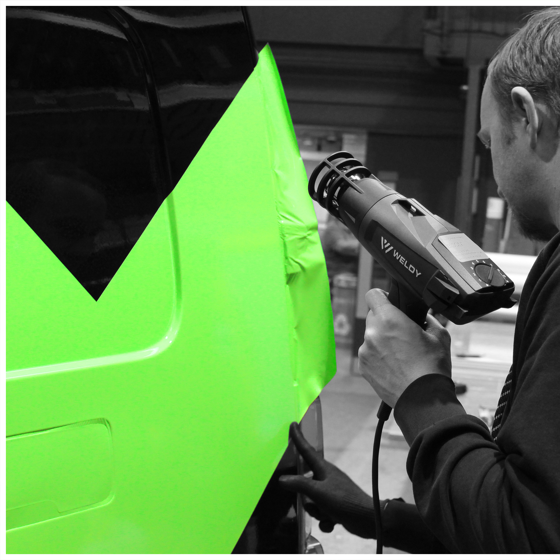

I came across BISON through BITA, we talked through the issues and looked at examples of their work, which gave me confidence straight away. The green stripes had been on the back of our trucks for 14 years, so keeping that history was important. The way BISON turned them into the M was clever and instantly recognisable. I remember seeing the design for the first time and knowing immediately it was the one. I expected a long back and forth, but the decision was surprisingly easy. The new identity is bold, striking and far easier to use – it takes fewer ‘think calories’, as you put it, and people instantly recognise it.
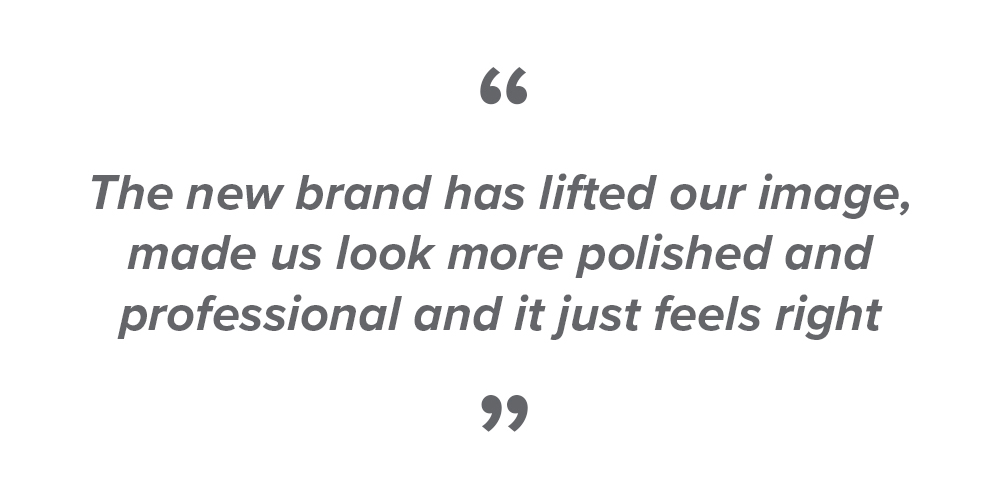
Since launching, we’ve had nothing but positive feedback. I’m really happy with the result and the brochure is phenomenal too. The new brand has lifted our image, made us look more polished and professional and it just feels right.