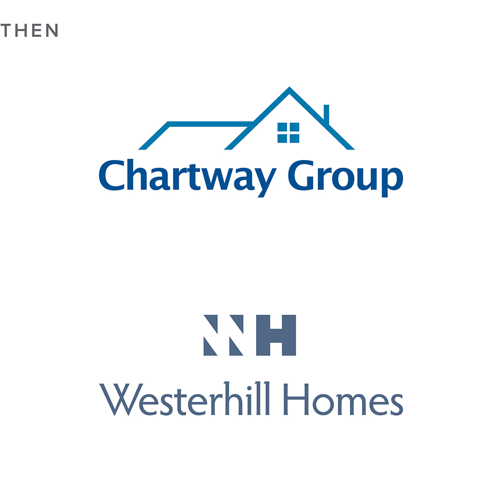
Businesses with a growth mindset always strive to improve; Chartway is no exception to that rule. In their first ten years they’d already reached an annual turnover of £90 million and a reputation as a leading player in building and construction services. As they embarked on their second decade in operation, they wanted to build on this success.
The Kent-based one-stop shop asked for our help in formulating a plan to achieve their aspiration. The first step was to reposition as a more premium brand and invest in a new identity.
During the discovery process, we invited the senior management team to join our exploration into Chartway’s existing position where we conducted site visits and a brand asset audit, using THE BISON BRANDING BLUEPRINT.
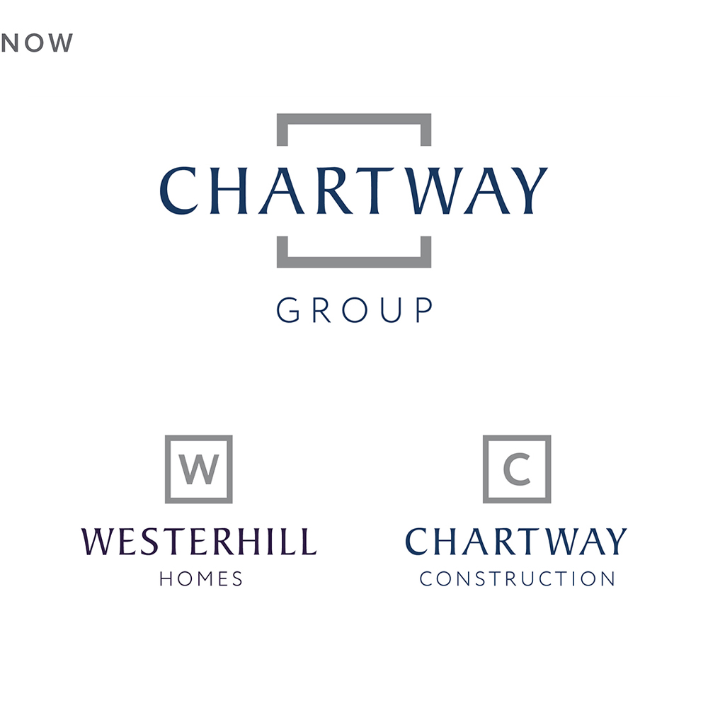
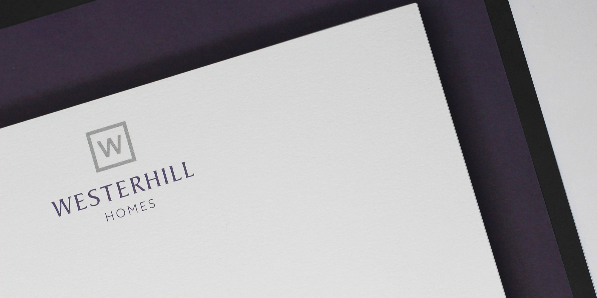
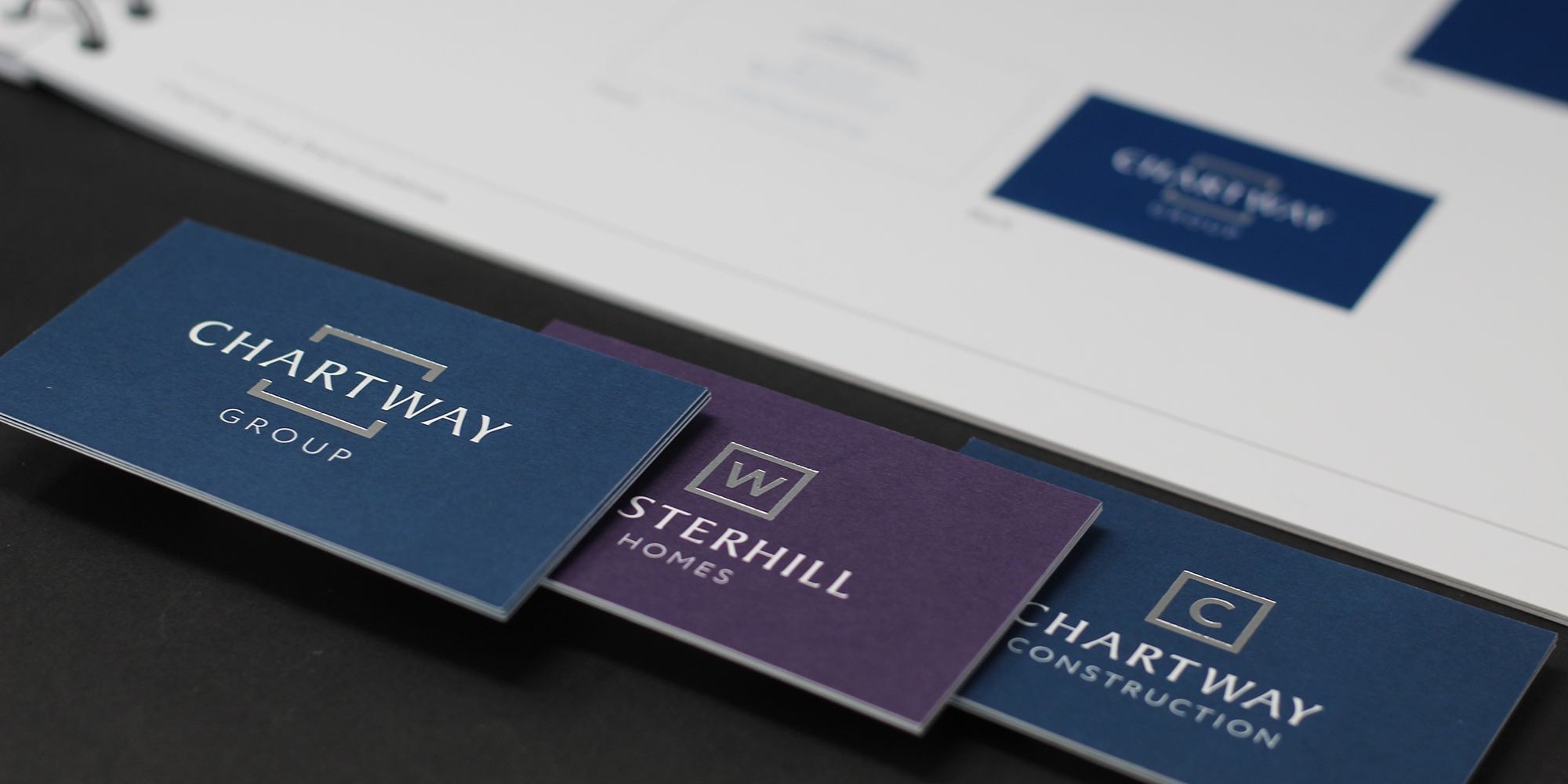
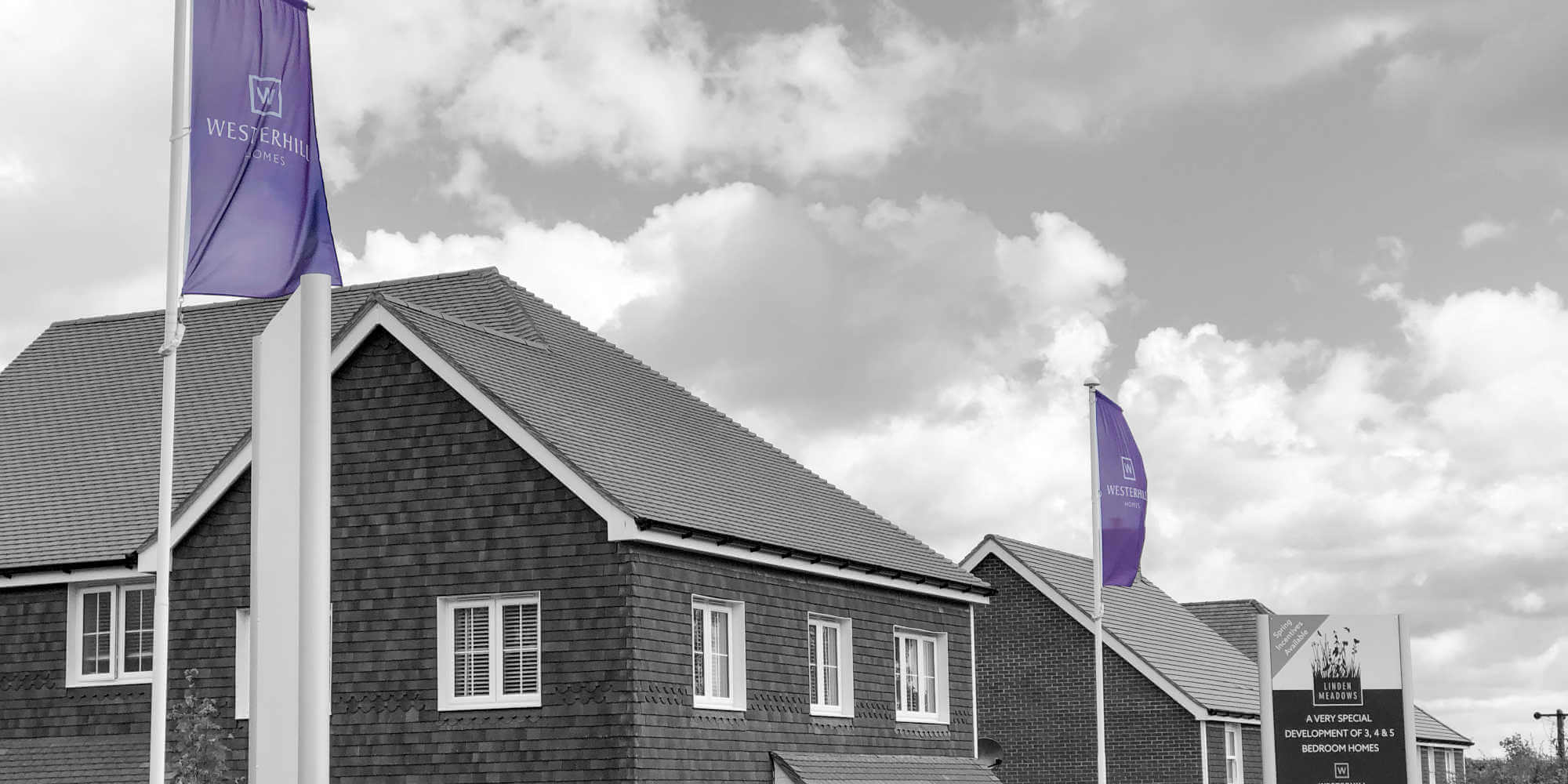
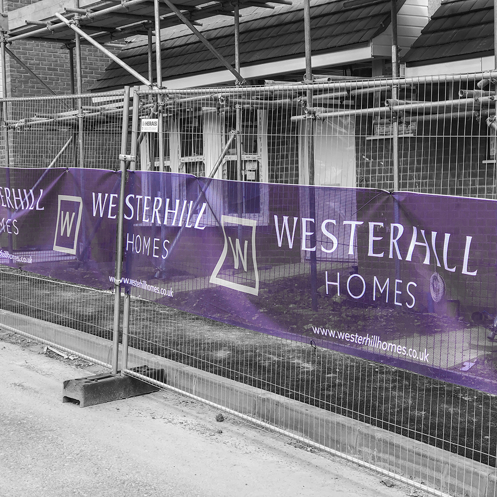
We found that Chartway wanted a clean and contemporary look for their new branding, but they were also keen to retain elements of their visual identity, such as their blue colour palette, which communicates their values of professionalism and reliability. Chartway also asked us for additional brand identities for two key divisions within the Chartway Group: its private homes arm, Westerhill Homes, and Chartway Construction.
They challenged us to develop three logos that would look both distinct and from the same family, whilst conveying the same values, professionalism and quality.
Equipped with our findings from the discovery process, we explored a range of options, including styles and tones, all of which showcase a high-quality positioning, and then developed creative concepts for the three Chartway Group brands.
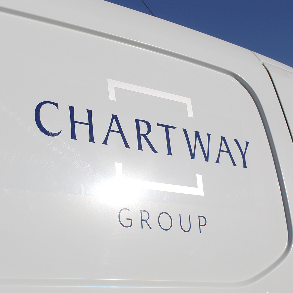
The chosen branding is built around a square, which represents the important house-building attributes of strength and stability, reassuring the high standard of workmanship.
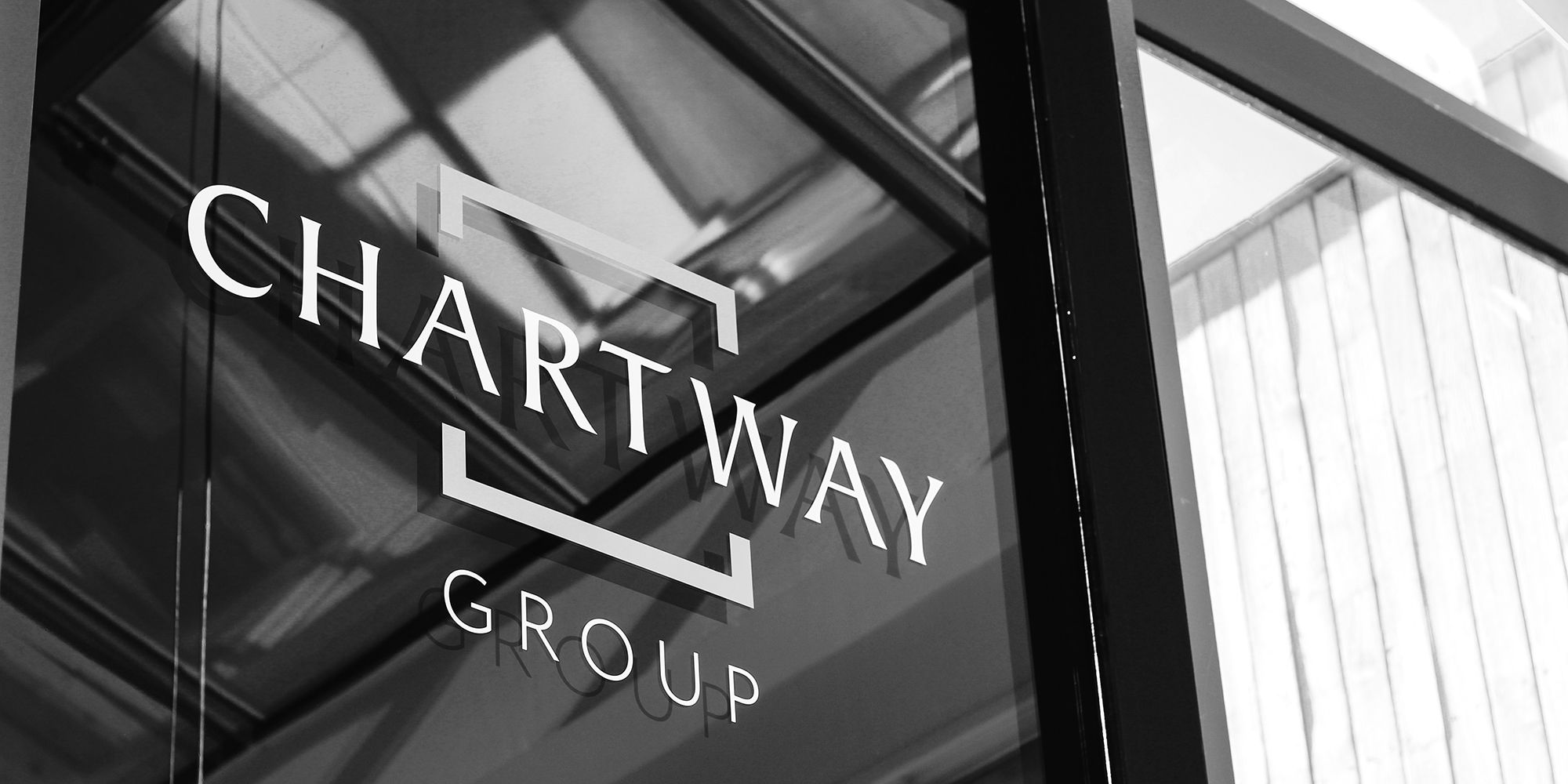
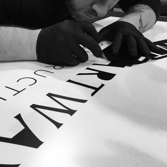
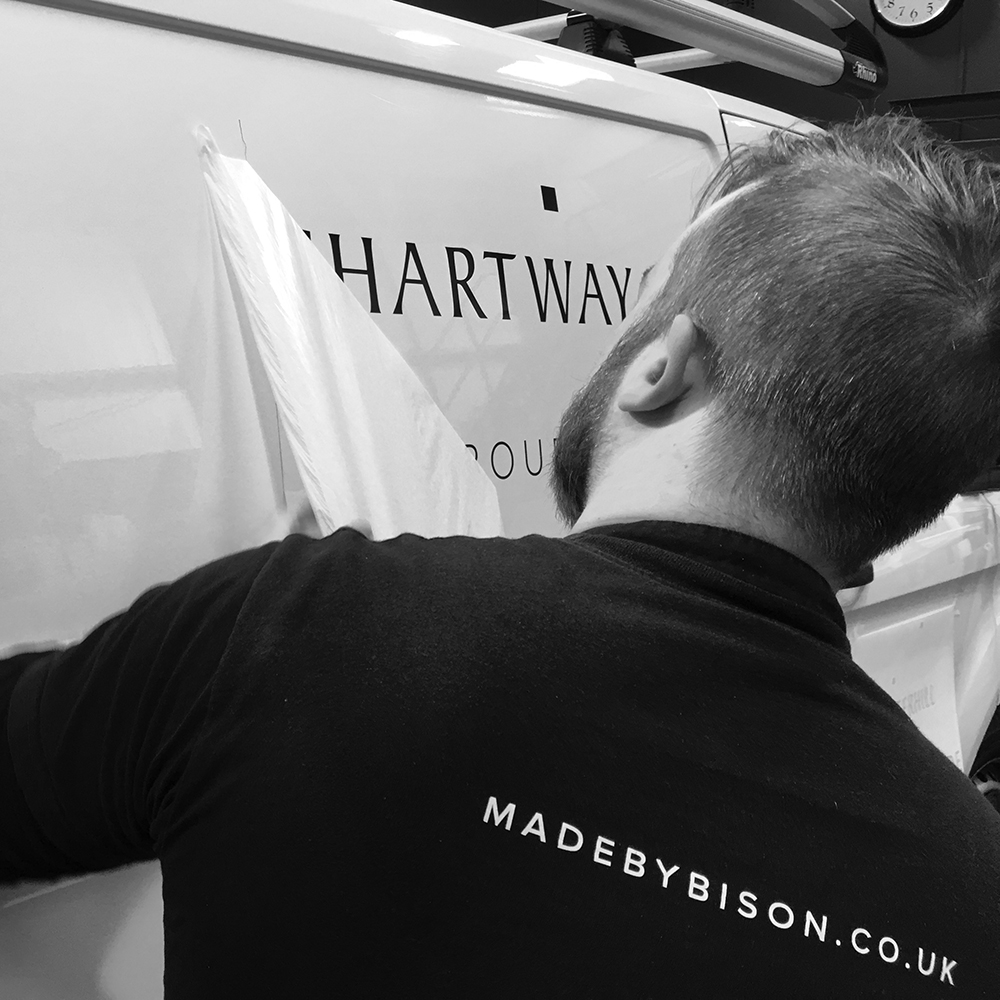
The square can be easily transferred across all businesses, along with the colour palette and typography, to build strong recall and a uniformed look. We also made sure that the new logos were sharp enough to make a strong impact on van livery and HQ signage.
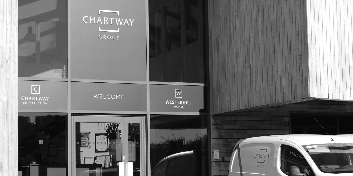
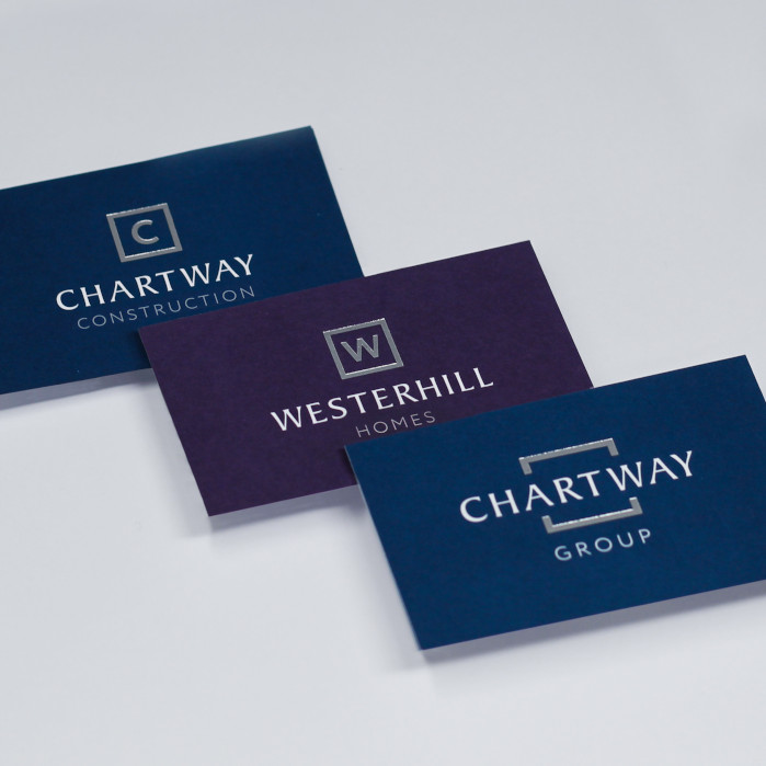
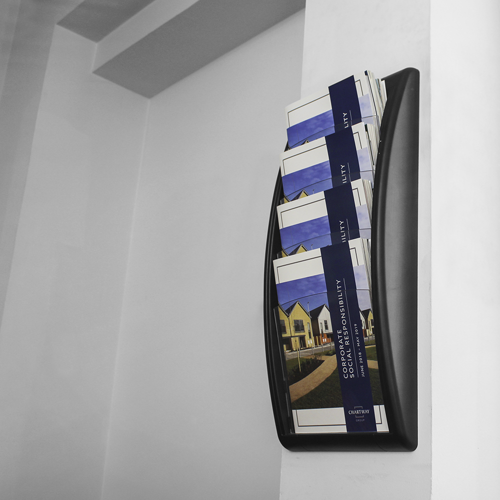
We rolled out the three new brand identities across their marketing collateral, including stationery, signage, social media and their fleet of over twenty-five vehicles. In line with Chartway’s repositioning to a premium brand, we proposed a superior finish for all their assets, including premium textured business cards with a luxury foil finish.
We implemented a solution to allow the team to call off their business cards at short notice without compromising on the look or feel. It was important that the Chartway team were proud of their new-look branding, and so we recommended high impact solutions for the HQ signage that help Chartway stand out from the crowd, as well as creating an impression with which the team and clients alike would want to associate.
Since the launch of the rebrand, Chartway have gone from strength to strength. The new, consistent brand identity has been a breath of fresh air that has united the group. Its simple, contemporary look has given Chartway a brand they can be proud of as they work towards achieving their aspirational goals for their next ten years.
We were reaching our tenth anniversary and upon reflecting on the business it became apparent that our brand identity might need modernising. It hadn’t been reviewed since we were founded – a time when the business was a lot different to today, hence reaching out to BISON for a brand review.
One of my main concerns about the process was that the board of directors wouldn’t agree, as all had a difference of opinion. BISON pulled all the ideas together and presented options that resulted in a brand that we are all proud of and that exceeded our expectations.
Our new identity is simple, modern and contemporary, BISON has successfully managed to create a synergy across all divisions: Chartway Construction and Westerhill Homes, as well as parent company Chartway Group.