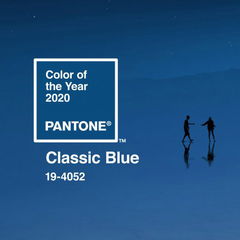
Two colourful decades have passed since colour expert Pantone first launched its Colour of the Year at the start of the new millennium. This year Pantone has chosen Classic Blue (19-4052), “instilling calm, confidence, and connection, this enduring blue hue highlights our desire for a dependable and stable foundation on which to build as we cross the threshold into a new era.”
The importance of Pantone Colour of the Year
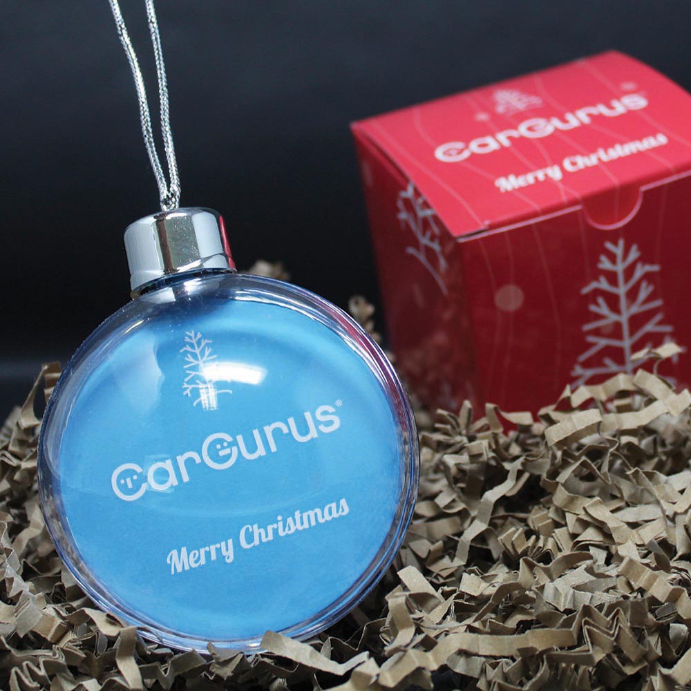
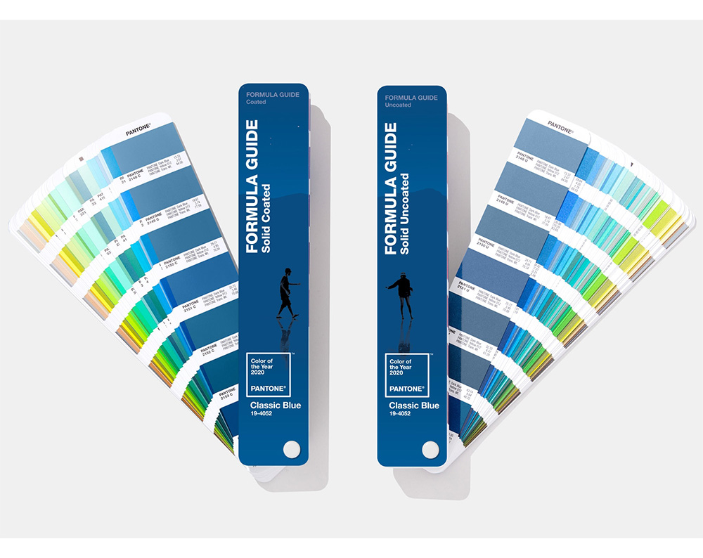
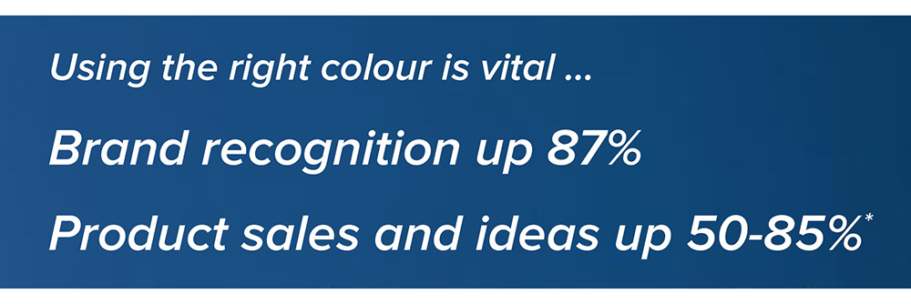
We are firm Pantone fans because the universal colour matching system helps us to keep our client satisfaction high. You will often hear us talking the language of colour and encouraging our clients to ensure Pantone colours are a vital part of their branding process. We can use your Pantone to consistently produce your printed assets and can give expert advice and solutions to ensure different substrates produce the desired results.
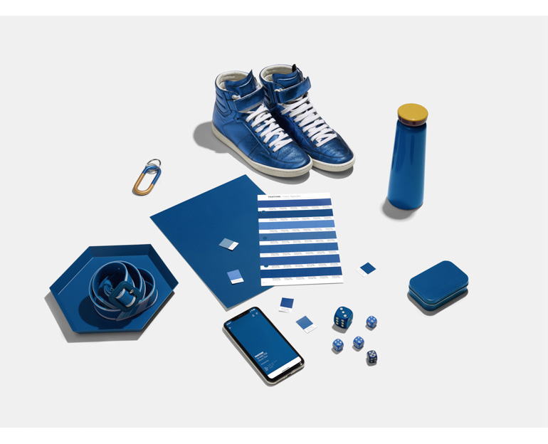
When the experts at The Pantone Colour Institute speak, the creative community listens. This is because Pantone boasts an unrivalled knowledge and insight into colour as well as an immense influence on design and consumers. The chosen reflective blue tone, Classic Blue will feature in new products and marketing communication for the coming twelve months. Be sure to keep an eye out when shopping for your new 2020 wardrobe or even that bold new look for your home … before you know it, you will see this comforting colour everywhere, it’s now even a specially crafted tea!
Five ways to use the Colour of the Year in your marketing
This year’s dependable versatile shade lends itself so well to print and digital marketing. Here are our top five ideas for using the 2020 Colour of the Year.
For extra exposure, showcase your creative use of the Classic Blue on social media using the hashtag #COY2020
Are you consistently communicating your brand? For guidance and to provide your customers with thought-provoking assets to support growth, call us on 01622 677541.
If you would like to keep updated with all news and developments, please subscribe to our mailing list.